Type: University
Semester: 3 (2014)
Skills: Packaging</p>
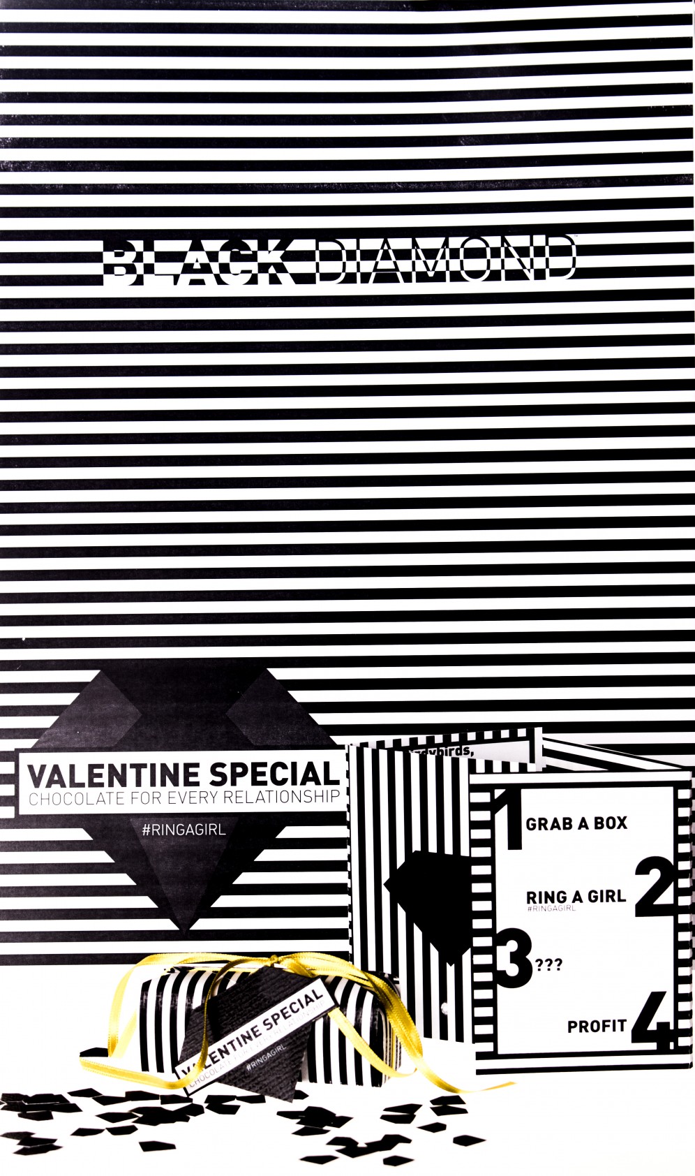
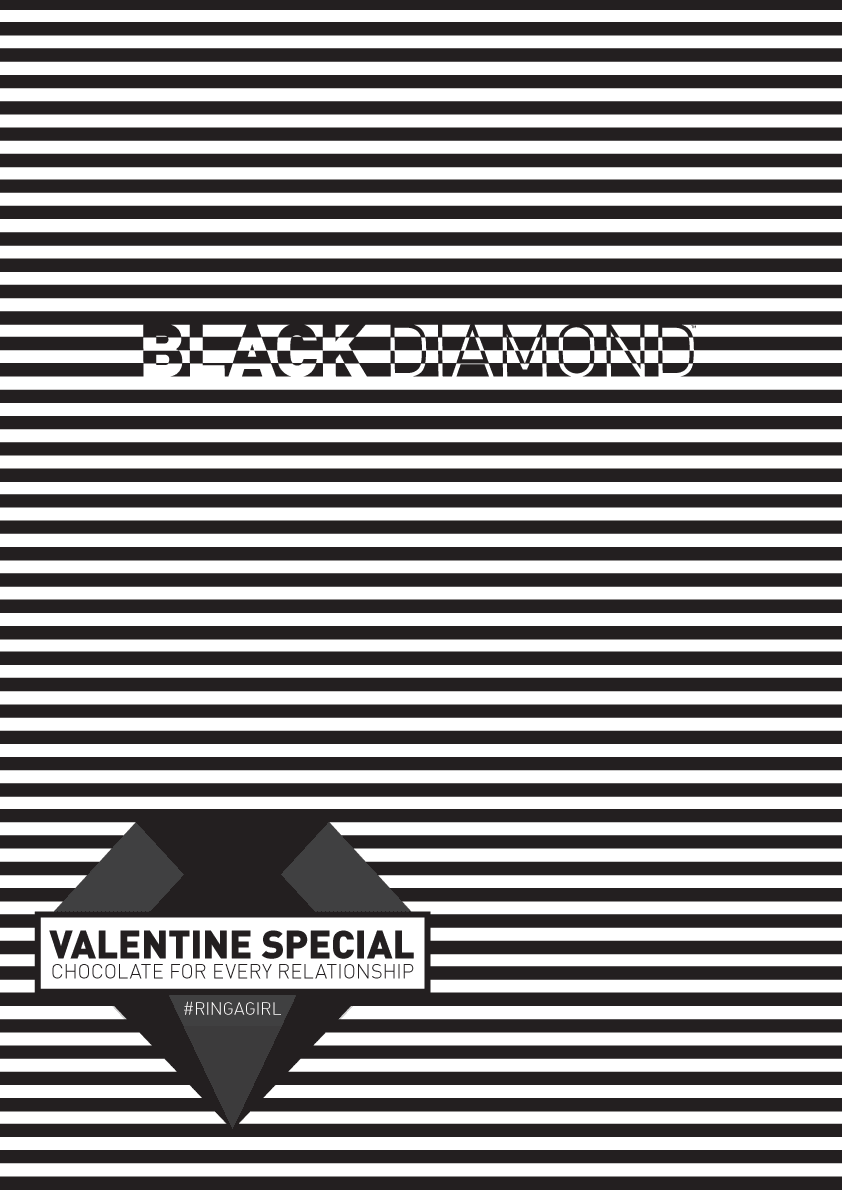
Chocolate rings as marketing strategy for jeweller.
Task
Create a tiny packaging for a product of your choice. The product should have 3-4 different varieties and an extra outer package. Also design a brochure and poster to be shown at the point of sale. Think of a limited edition.
Student Thibault Jan BeyerTJB
Tutor Natasha Cvetkovic
Institution Kölner Design AkademieKDA
Term Three
Concept
Christmas is over - the jeweler Black Diamond is planning a valentine incentive. He want’s to give away chocolate. I came up with the idea of jewelery made out of chocolate, given away, in store, for free. There is a ring for each relationship type: love, friendship and hatred.
Target group
Young Men 20-30. The so-called Hedonistic milieu: Fun and excitement oriented, modern, lower middle class. They live in the here and now. Well networked in social media. They want to expose themselves to the world and share what they like. They love to meet friends in the city and having fun. Therefore, their touch-point is social media and local stores.
Looking at competitors
One would think that the jewellery industry relies on modern and innovative advertising, such as the fashion industry. However, If you look around, you’ll see, that the current advertising is restrained, boring and outdated:


They only show supermodels wearing the product. They want that the customer to think that he will turn into a supermodel when wearing the jewellery. A typical, outdated attitude to advertising. Customers today are no longer sheep – they are aware that it won’t happen. This kind of advertising could even discourage buyers since they can’t identify with those models. One might think “I’ve to look like a supermodel to wear this jewellery”.
Aim
The graphical rigor of Black Diamond is both: modern and eye-catching. No one can overlook it. The campaigns aim is that the client share his experience (such as the girls reaction when the product is offered) on social media. Which will go viral. Finally, the manufacturer will become well-known.
Visual
Lines lines and lines. Stringent geometry is young and modern. Likewise, the provocative wording. Associations with Thomas Sabo are welcome = high-priced. Associations with prison are desirable = dangerously beautiful, you would go to jail for the rings. Associations with cigarette warnings are welcome = Attention Addictive. The outer 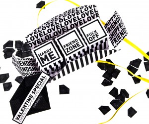 packaging is based on a thick chocolate bar. It contains 3 small ring boxes – exactly the same as for the usual Black Diamond rings. Packaging material is Vergé Blanc from Gmund having a linear grain that supports the linear look.
Sayings
- The love-box says “marry me”.
[caption id="attachment_1225" align="alignright" width="300"]
 Unknown Author[/caption]</li>
- The friendship-box has the provocative inscription “friend zone”: a platonic, friendly relationship in which one of two still has erotic/romantic feelings whose aren't reciprocated. A widespread and well-known term often reiterated in comics.
- The enemy-box uses the vulgar "fuck off". </ol>
- In general, by an eye-catching imagery, it is impossible to look away.
- The brand comes into consciousness for both: the recipient as well as the donor.
- Digitally through the hashtag #RINGAGIRL: clients are motivated to share their experiences on social networks, which increases the reputation. The brand uses the same hashtag for advertising purposes - thus blurring the advertisements and the user-generated contributions, thereby advertising reaches more interested people without being intrusive. #RINGAGIRL is a hashtag (# + word) – Hashtags are used on social networks to filter posts within the network. An example:
Rings
The rings are replication of the real ones but made of chocolate. In the love-box of course is the diamond ring. In the friendship-box is a no-frills ring. The enemy-box is a middle finger ring.
The marketing strategy
The small special edition will be gifted in the Black Diamond shops. Thereby, increasing its visibility in multiple ways:
Logo
The logo is a black diamond reflecting the company name “black diamond”. The diamond is reduced, two-dimensional and minimalistic. The logo looks edgy. The diamond reflects the products, namely quality rings. It stands for luxury and exclusivity. The black color gives a certain sex appeal. As the logos of most competitors are realistic, it stands out from the crowd. Almost like an underdog – hedonists love underdogs because they break the current conventions and expectations.
font
The font used is the FF DIN in BLACK, a very modern font, standing for a modernist product.
Packshots


Comments