
Typography is probably the most overlooked thing when developing for the web. However, if you want a decent design, it’s the most important one.
When type is bad your product is likely to look unprofessional. The aim of this post is to handhold beginners in creating impactful typography for their websites. I’m writing for programmers/developers who want to know the secret of beautiful websites. I’m pretty sure that you have a lot of textual content that you want to display in a way that people enjoy reading it. So let’s start.
Since typography has a tradition that goes back to the first days of human kind you’ll find a lot of literature on that matter. Most principles also come true for digital design. So, let me give you some general typographical knowledge first.

Choosing the right font
There is not such thing as a universal right font. Whether a font is good or not depends on many factors such as your audience, language, the message/feeling you want to convey and personal taste. Every typeface is unique and thus has a unique look and feel. Some appear friendly, other serious, other artsy or even intimidating. That makes the process of choosing the right one difficult. No wonder that people commit their whole life on the subject. This might be why people just go for the most popular or the standard. Let’s change that! If you don’t want to write a thesis on typography it is easier than you might expect. Choosing the right font really comes down to the following points.
1. Choose one that is readable
This should be granted. When you’re still able to read your text while being drunk under bad light condition, you can use it. But still, some unreadable typefaces can be interesting. So you’re allowed to break the readability rule if you want to add some visual tension to your design. If you do so, use it wisely. Only for big headlines where it is not important that the user reads them carefully.
2. Choose one that fits the content
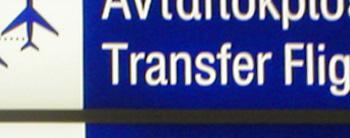
Do you want something that provokes intense feelings or that is easy for the eye? Test the typeface on the device where it will be read. Some work better on some devices than other. Garamond is considered to be the most readable font for printed books while Open Sans enjoys a good reputation on screens. When building a website/app for children and reading beginners, choose a font where you can clearly differentiate characters. E.g. I and l, but also d should not just be a mirrored b but have a different look.
Avoid: Arial, Times New Roman, Comic Sans, Trajan, Papyrus. Some of them are ugly by nature, other just overused. Only use them when you know what you’re doing.
3. Choose one that conveys the right message
Different families evoke different feelings. Dan Mayer did a good job at categorizing the common families into five groups:

Geometric Sans based on strict geometric forms, often referred as being minimalistic. They are clear, objective, modern, universal but also cold, impersonal, boring. Examples: Raleway, Helvetica, Univers, Futura, Avant Garde, Akzidenz Grotesk, Franklin Gothic, Gotham.

Humanist Sans less strict than the Geometric, closer to handwriting and thus friendlier. They are modern yet human, clear yet emphatic but can also look fake, uncertain, generic. Examples: Lato, Open Sans, Roboto, Gill Sans, Frutiger, Myriad, Optima, Verdana.
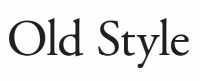
Old Style waking up the past. They feel classic, traditional which can be good and bad at the same time. It depends if you want it to feel traditional or not. Examples: Garamond, Garamond, Garamond and Jenson, Bembo, Palatino.
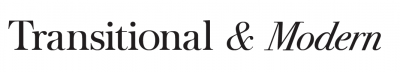
Transitional and Modern more geometric, sharp and versatile than the old style. Higher contrast in thick and thin strokes. Strong, stylish, dynamic but can also look strange. Examples: Baskerville, Bodoni, Didot.
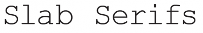
Slab Serifs have very specific associations (thinker, tough guy, bully, nerd, urban, sophisticated, cowboy). They add character to your design but can easily become too much distraction. Examples: ChunkFive, Roboto Slab, Clarendon, Rockwell, Courier, Lubalin Graph, Archer.
Rag?
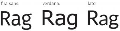 The best way to compare similar fonts is by comparing the word Rag, the biggest difference is often found in those three letters.
Round ?
 The rounded versions are more readable in sunlight/light reflections. As for highway signs, or for light-boxes. Rounded corners reduce the light irradiation to better distinguish an e from an a for example. Round edge = less area = less light blur. Since any electronic device emits light, in theory, the rounded versions should be more readable. Although the impact is very subtle.

Combining
Of course one font is enough if you use different weights. If you limit yourself to one font and do it well, your designs can look clear and minimalist. It is how you’ll get what is called the Scandinavian design. However, having two font-families can create a huge impact. What web-designers often do is to choose a different Family for their headings. What works best is a Serif font as header and a sans-serif for the paragraphs or vice-versa. Simply because it is the strongest layer of contrast you can add. Hence, the masters of traditional typography: Emil Ruder, Anton Stankowsky and Otl Aicher, to name a few, teach us to use sans-serif for headings and serif for copy. It is a good practice. But if your audience do not have top notch retina displays, a sans-serif for the copy and serifs for headings is better since bad displays have issues displaying serifs well.
Always go for high contrast:
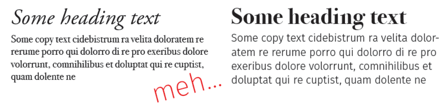
The example on the right is much more pleasant, isn’t it? The reason is that the seconds contrast is higher: it’s a bold vs thin weight, it’s a (transitional) serif font vs a (humanist) sans, an old font with tradition (Bodoni) vs a very new and modern font (Fira Sans). While keeping the same text flow: have a close look at the typefaces, in both you can clearly see a similar kind of duck board. Also, when you look at the cap-height, both have smaller t letters and the point of their i is also very high. Both examples convey that the author/website/text is cultured due to use of a traditional font (sometimes using a serif is enough to evoke that feeling). However, the second example counteracts this feeling by using a very modern copy font and thus communicate that while being intellectual he isn’t stuck in ancient history. It gives an extra modern touch.
What if you don’t have a large collection of fonts and only little knowledge? Looking at suggestions from professionals is always a good idea; They all have great suggestions, Hans Peter Willberg & Friedrich Frossman for example suggest to combine Garamond + Gill, Helvetica + Walbaum or even Futura + Bodoni but never an old style with a transitional. It is also a good practice to look at what other professionals currently do. Typ.io is a very good web-app that will save your time doing so. You’ll find a decent amount of other web-apps out there. As a simple web-search could be frustrating, here is a small collection of good ones:
- Typ.io, as mentioned above
- Google-Type & BeautifulWebType, curated and well designed websites, pairing fonts from the google fonts library.
- Typespiration, lots of great inspiration, also curated by designers. With css code.
- FontFlame, a tinder approach to font pairing (it is not perfect but the more users it has the better it gets)
- Typegenius, is quite good if you have a starting font. Downside: there are not so many at the moment.
- Typewolf, curated collection of websites with good font pairings.
- JustMyType, curated pairings from Typekit and Hoefler & co (if you are using any of these services)

Adjusting
Once you have the right fonts for your job, the most difficult part is done. Make sure to use a webfont. It has more information than the regular one. E.g. a web specific kerning. Nowadays almost every professional Font website offers web versions. Fonts from the major CDNs as Typekit, Hoefler&Co., Fonts.com, EdgeWebfonts and google fonts are webfonts. Another good resource of free webfonts is the league of movable type. Today, all webfonts should be distributed with following filetypes: .woff, .woff2, .eot, .ttf and .svg. There are services to convert your font but results will differ from case to case, so make sure to test them. Now you can start implementing them. But there are some things to pay attention on, and this is where digital differs from print.
Font Size
people always refer to 12px/pt for being the most readable font-size. That’s true for print but not for web. 1em is the browsers default, which is most probably 16px, that’s OK. But, even better is having 16–18px on small screens and 18–21px on wide screens. That might sound confusing but keep in mind, that the distance of a mobile device to your eyes is less than the usual distance to desktops or laptops. Go for large headings: 35–50 for h1 and 28–40 on h2. Don’t go smaller than 10px. Unimportant notes should be around 12–15px. This article itself is set in 2rem = 20px. Dare to increase your font size, your readers will be thankful.
The power of rem units Rem gives you flexibility. Scaling elements up and down becomes a breeze. It will make your designs easier to adjust during development and allow users to control the scale of your sites for better accessibility. Em is good but becomes very complex since em is always dependent on it’s parent element. That’s why rem (root em) was introduced. It is only dependent on the root of your document (the html tag). E.g. in general browsers have the standard value of 16px, then for a div with 2em the content would have 32px. Now let’s say I add another div as child of the first one with also 2em, the content of that one will have 64px = 32*2. Confusing right? If rem is used instead the first and second div would both have 32px since rem always take the root element (html) as base, not the parent element. For even more ease of use you can set your html font-size to 62.5% = 10px, then 1.7rem is equal to 17px. If for some reason you want to increase or decrease your overall font-size, it only comes down to adjusting the font-size of your html element. All other elements will adapt. Cool! Having smaller font-sizes on mobiles is now very easy to do.
Spacing
 Letter Spacing The problem with decreasing or increasing the letter-spacing is that it might break the fonts ligature. So, always check if your ligatures are still all right when changing the letter-spacing. The magic number of letter-spacing: -0.05px; has been around for a while. If you look at the comparison, the kerning seems better with a -.005rem spacing. The s, for example, is almost touching the t without that letter spacing. Overall, your text blocks will look more solid with -.005rem. An extra of +0.1-+0.4px letter-spacing might be a good idea if you feel that your letters are to close to each other or not that readable. Also, for small text, for all caps or light text on dark background use a wider letter-spacing.
 Prof. Cyrus Dominik Khazaeli suggests to decrease the spacing the larger the font-size gets to increase its impact. See how the difference in spacing is changing the tone of the typeface? The headline with reduced spacing feels way more resolute and expressive.
Word Spacing The word-spacing should always be smaller than your line-height. In general the default word-spacing is fine.
 Line Height The longer your paragraph get the higher your line-height must be. Else the reader will get lost. In most cases, you’ll have a readability benefit by increasing the line-height by around 1.2-1.6 depending on the font.
Line Width Lines that are too short or too long are tiring for your eyes, have lines with around 40–70 characters. To achieve this on pages with a lot of text you can use css columns or fill in images or citations.
Padding When you have text surrounded by borders or other elements, don’t forget to add some padding to your text blocks, otherwise they look squeezed. If possible have the distance to the top be slightly smaller than to the bottom, otherwise the text fall down optically (javierbytes visual center app might be helpful to find the visual center of images)
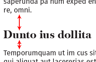 Headings Headings should always be closer to the elements or paragraphs they belong to. Default heading settings make them float between two paragraphs with equal distance to each. Change that to be closer to the related paragraph and further away from the other one. That will help your readers brain to draw optical connections. Actually that is true for all content relations (e.g. graphics).
Spacing Instead of using weird borders to separate and structure your content, play around with the spacing of your elements. Often adding space resolves your structuring issue. Try to use borders only if absolutely necessary, often they are more disruptive than helpful. Don’t be hesitant on white space, you have endless space available (pun not intended).
Justification
Avoid justification. The controls for nice justifications as we have them in traditional media is not given in css yet. The current results look poor, we have to wait until decent justifications are possible. I can’t recommend using a plugin for that matter, but it’s your best bet if you die for justified text. Typeset e.g. is one. It is very important that the space between your words is not too small nor too larger. Hyphenation should be enabled and if possible controlled, so that you have breaks that make sense and try to avoid more than two breaks in one paragraph. CSS has a Hyphens but the browser support is very bad. In HTML, you can use ­ to insert a soft hyphen where you want it to potentially break. You might also use a plugin to get nice hyphens as Hyphenator or Hypher. Never justify a heading. Never justify notes.
Emphasis
Bolds Bold (font-weight: >600) is active. Shows what the text is about before starting to read.
Coloring Colors are active and as strong as bolds. Unless you dim the color. So keep in mind, that your links drag attention (you can use Metalinks, to reduce it). Besides web-accessibility, that’s one of the top reasons why you should always use descriptive links. Stop linking the keyword here!
Small Caps Small Caps (font-feature-settings: "smcp" 1; or font-variant: small-caps;): usually used for proper names. Add some letter-spacing if you use them. Only use them if your font supports them.
All Caps All caps (text-transform: uppercase): shouting. Decrease the font size and add letter-spacing.
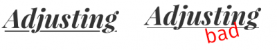 Underline Underline (text-decoration: underline): strong but less than bold/semi-bold text. Could be confused with links. Can be beautiful if well done but that is also impossible in proper css at the time being. There is UnderlineJS and Eager’s solution although those are bulky. If you’re dying for underlines as I am, use this small hack inspired by Eager’s solution, it fakes it quite well with a decent support. It’s called SmartUnderlines. Anyway, a good underline is as thick as a normal character line, it has holes around the descender and should be at the golden ratio Y distance.
Italic Italic is the softest emphasis. It is only visible when reading the text. Make sure to only use italics if the font supports it (else it only weirdly stretches the characters).
Hierarchy
Make sure to have a good structure in your writings, you don’t want your reader to get lost. This is especially important for long writings. The book first aid in typography from Hans Peter Willberg & Friedrich Frossman suggest following heading structure:
 1. A huge, bold h1 with a big margin. A bold h2 at smaller size but with the same margin. h3 in italic, same size as the copy, without bottom margin. Lastly h4 bold and italic within the paragraph.
2. Huge, bold h1 with big margin. Bold h2 at smaller size but with same margin. h3 same size, weight and style as copy but still with the same margin as h1 and h2. Lastly h4 is italic without bottom margin
I use a variation of 1 in my writings. You obviously don’t need such a deep structure if you only have a small textual content. As long as you have a clear hierarchy you’re good. Beware that people are very likely to lose track if you go deeper than four levels. Even h4 is borderline. For smaller writings h1 and maybe h2 and your copy is enough.
Smart Characters
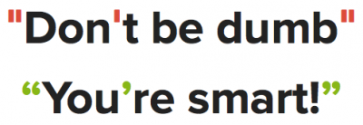 Use smart quotes.
Don’t forget other basic character rules as differentiating a hyphens from a dash; A hyphens binds two words together, a dash indicates distance (e.g. re-do vs 2000–2004), a dash indicates pauses and is used for the minus sign. Besides your school, national punctuation day is a good resource to learn more about smart characters.
Specialities
Color Full black on full white is painful to read, you should use some lighter black such as #333 and darker white as #f6f6f6 for even better readability. Firefox will still have some rendering issues, to fix that use -moz-osx-font-smoothing: grayscale. However, full white is OK if you have already soften your black. Note that shitty screens won’t make any difference.
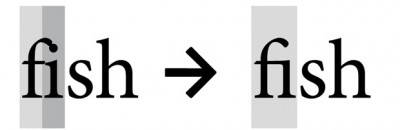 Ligatures If your font has ligatures or any other specialties, you can enable them with font-feature-settings in css (it’s enabled by default on most browsers). Use the keyword liga for ligatures.
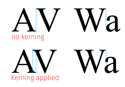
Kerning Kerning is by default metric, you can enable optical kerning with font-feature-settings and the Keyword kern. Together that would be: font-feature-settings: "liga" 1,"kern" 1;. kerning will also be enabled via text rendering options (see below). Following letters profit the most of proper kerning: A V W L T and f r v y.
This font-feature-settings is very powerful, you should check it out. Despite, there is one downside, font-feature-settings is sadly not widely supported yet and it is dependent on a font to supply that extra information (this is how you will distinguish the good web-fonts from the bad).
Text Rendering The css property text-rendering allows you to chose quality of text over speed and vice-versa. Use text-rendering: optimizeLegibility; for an extra readability boost. Beware, there are some bugs with text-rendering, also negative impact on page load and overall performance when used too often. So, you might add it only on longer static text.
Wrapping up
Basically you should now be set to create awesome, usable and readable works. Always write comments if you feel that I forgot something or if you know anything better. Living documents are always more fun than static ones. Also I would enjoy to see some of your before after pictures if you feel like reworking your page. Have fun!
PS: don’t forget to share the knowledge and to follow me on twitter or via email if you liked this post :)


Comments